CSS Border is a visible border created around HTML items using CSS borders. They have several adjustable attributes that let you alter the border’s appearance, color, and width. The following are some essential qualities and their applications:
An HTML element’s borders can be visually indicated with CSS borders. They can be used to improve the overall user experience, add visual prominence, and create divisions between areas of a webpage to improve its layout and design. You can specify the borders’ width, style, color, and form using the CSS border attributes.

Table of Contents
ToggleBorder Properties
A summary of the primary CSS border attributes is shown below:
- Border-width: Indicates the border’s width. Accepts terms like thin, medium, & thick, or value in units such as px, em, rem, etc.
The border width of an object can be set using the border-width characteristic. Different measures, like pixels (px), em units (em), or percentages (%), can be used to define the border width. Additionally, you may choose unique border widths for the top, right, bottom, and left sides.
border-width: 2px;
- Border-style: Specifies the border’s style. Common styles are solid, dotted, dashed, double, groove, ridge, inset, outset, none, and hidden.
=> An element’s border style can be set in CSS Border using the border-style attribute. You can choose from several pre-defined border styles
=> Border Styles: None Borderless (default).
=> solid: A border with just one color.
=> dashed: A string of brief characters or strokes.
=> Dotted: A collection of round dots.
=> Double: A pair of uninterrupted lines. The border-width value equals the total of the two lines plus the space.
=> Groove: A carved appearance that gives the border the appearance of being pressed into the page.
=> ridge: The reverse of a groove’s effect. It looks as though the border is protruding from the page.
=> Inset: Gives the border the appearance of being incorporated into the page.
=> Outset: What inset is the opposite? The border is visible.
border-style: solid;
- Border-Color: Determines the border’s color. Color titles, hex codes, RGB, RGBA, HSL, or HSLA values can all be used to specify this.
The border color of a component can be customized using CSS’s border-color attribute. Numerous techniques, including called colors, hex values, RGB, RGBA, HSL, & HSLA, can be used to specify the color.
border-color: red;
- Border: A shorthand property that combines
border-width,border-style, andborder-color.
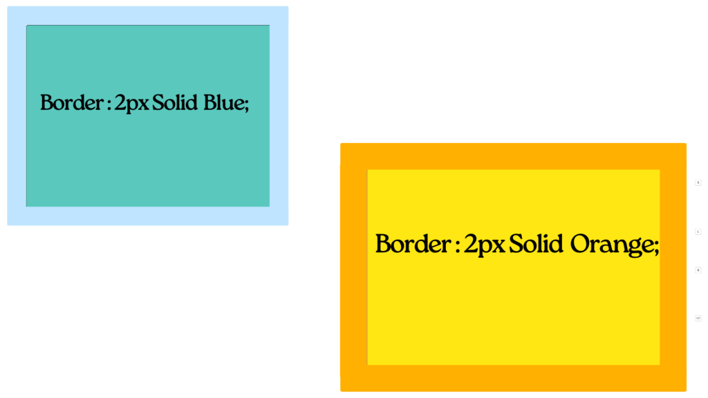
In CSS, the border property is a shortcut that lets you set the border width, style, & color of a component in a single declaration. The border width, border-style, & characteristics are combined to create it.
border: 2px solid red;
- border-radius: Curves the border’s corners. To modify each corner independently, enter four values or a single number to set all corners to be the same.
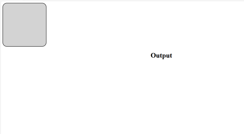
The border-radius feature in CSS is used to give an element’s border rounded corners. You have two options: either describe distinct radii for each corner or specify one radius that covers all four corners.
Basic Syntax
.element {
  border-radius: 10px;
}
Individual CSS Borders
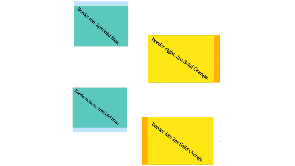
In CSS, you can style individual borders for each side of an HTML element using specific properties for the top, right, bottom, and left borders. This provides flexibility to apply different widths, styles, and colors to each side of the border. Here’s how you make utilization of these attributes:
These properties can also be used to set borders for specific sides of an element:
- border-top
- border-right
- border-bottom
- border-left

Each of these properties has sub-properties for width, style, and color, such as border-top-width, border-right-style, etc.
border-top: 2px solid red;
border-right: 2px dashed blue;
border-bottom: 2px dotted green;
border-left: 2px double yellow;
These can also be broken down into width, style, and color:
- border-top-width
- border-right-width
- border-bottom-width
- border-left-width
- border-top-style
- border-right-style
- border-bottom-style
- border-left-style
- border-top-color
- border-right-color
- border-bottom-color
- border-left-color
Examples:
Here are some practical examples:
Example 1: Basic Border
.box {
    border: 2px solid black;
}
Example 2: Different Borders for Each Side
.box {
    border-top: 2px solid red;
    border-right: 2px dashed blue;
    border-bottom: 2px dotted green;
    border-left: 2px double yellow;
}
Example 3: Rounded Corners
.box {
    border: 2px solid black;
    border-radius: 10px;
}
Example 4: Complex Border-Radius
.box {
    border: 2px solid black;
    border-radius: 10px 20px 30px 40px;
}
Full Example with HTML and CSS
<!DOCTYPE html>
<html lang="en">
<head>
    <meta charset="UTF-8">
    <meta name="viewport" content="width=device-width, initial-scale=1.0">
    <style>
        .box {
            width: 200px;
            height: 200px;
            border: 2px solid black;
            border-radius: 20px;
            background-color: lightgrey;
        }
    </style>
    <title>CSS Border Example</title>
</head>
<body>
    <div class="box"></div>
</body>
</html>
OR, Shorthand Properties
You can also use shorthand properties for individual sides:
- border-top
- border-right
- border-bottom
- border-left
Each of these shorthand properties can combine width, style, and color.
border-top: 2px solid red;
border-right: 4px dashed green;
border-bottom: 6px dotted blue;
border-left: 8px double orange;
Example
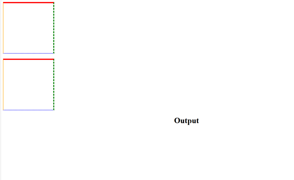
Here is an example of how to use individual border properties in an HTML and CSS file:
<!DOCTYPE html>
<html lang="en">
<head>
    <meta charset="UTF-8">
    <meta name="viewport" content="width=device-width, initial-scale=1.0">
    <style>
        .box {
            width: 200px;
            height: 200px;
            /* Individual border properties */
            border-top-width: 5px;
            border-top-style: solid;
            border-top-color: red;

            border-right-width: 4px;
            border-right-style: dashed;
            border-right-color: green;

            border-bottom-width: 3px;
            border-bottom-style: dotted;
            border-bottom-color: blue;

            border-left-width: 2px;
            border-left-style: double;
            border-left-color: orange;
        }

        .box-shorthand {
            width: 200px;
            height: 200px;
            margin-top: 20px;
            /* Shorthand border properties */
            border-top: 5px solid red;
            border-right: 4px dashed green;
            border-bottom: 3px dotted blue;
            border-left: 2px double orange;
        }
    </style>
    <title>CSS Individual Border Example</title>
</head>
<body>
    <div class="box"></div>
    <div class="box-shorthand"></div>
</body>
</html>

In this example:
- The
.boxclass demonstrates using individual properties for each side of the border. - The
.box-shorthandclass uses shorthand properties for each side, combining width, style, and color.
These methods allow you to have complete control over the borders of an element, enabling complex and detailed styling.


