
CSS Conditional Rules
Introduction to CSS Conditional Rules
All the CSS Conditional Rules do is apply the CSS style to a document according to a predetermined circumstance. This means that the condition can be true or false, and it will be carried out based on the words and style.
- Using CSS Conditional Rules, styles can be applied based on certain criteria.
- Styles can be applied in response to certain parameters, such as device type, screen size, or supported browser features.
Effective usage of CSS Conditional Rules can improve user experience significantly by increasing web page responsiveness and adaptability to different devices and conditions.
These conditional rules, that begin with an @, eventually fall under the CSS at-rule.
CSS at-rule:
- CSS at-rules are unique declarations or instructions that give the CSS processor more details.
- A set of rules for CSS or a clear instruction are typically included, and they typically begin with the “@” sign and an identification.
These at-rules offer effective methods for improving your CSS stylesheets’ adaptability and functionality.
Types of CSS Conditional Rules
The CSS Conditional rules are:
- @supports
- @media
- @import
- @font-face
- @keyframes
- @charset
- @namespace
- @page
- @document
Keywords:
When using CSS Conditional Rules, three keywords are possible. They are as follows:
- not: used to verify the opposite of what the condition requires.
- or: used when executing the style block on the assumption that any one of the several conditions listed is true.
- and: used to verify two requirements; if they are both met, the style block is run.
@supports:
The purpose of the @supports conditional rule is to determine whether a particular CSS property is supported by the browser and to apply style accordingly.
Syntax:
@supports ('condition'){
element{
/*style to apply*/
}
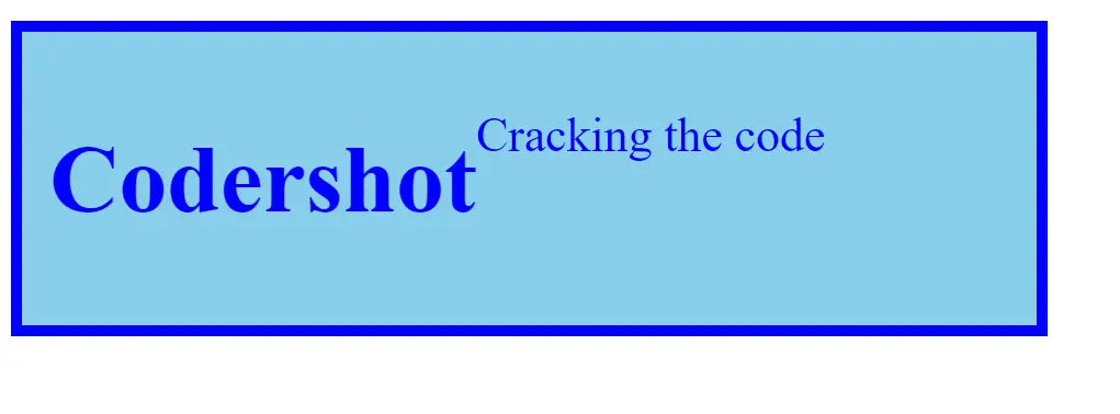
}Example:
<!DOCTYPE html>
<html>
<head>
	<title>Supports</title>
	<style>
		@supports (display: flex) or (display: -webkit-flex) {
			div{
				display: flex;
				justify-content: flex-start;
				color: blue;
				border: 8px solid blue;
				padding: 20px;
				font-size: 35px;
                                background-color: skyblue;
                                 width: 700px;
			}
		}
	</style>
</head>
<body>
	<div>
		<h1>Codershot</h1>
        <p>Cracking the code</p>
	</div>
</body>
</html>
Output:
@media:
One rule that is used to apply style based on media queries is the @media conditional rule. This feature allows you to apply the selected style based on the width and/or height of the device.
Types of media:
- all(by default): Fit for every kind of device.
- print: Printer gadgets take advantage of it.
- screen: It is applied on mobile and computer screens, among others.
- speech: It reads the page using screen readers.
Syntax:
@media('condition'){
                    element{
                                  /*style to apply*/
                                    }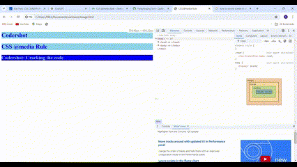
}Example:
<!DOCTYPE html>
<html>
<head>
	<title> CSS @media Rule </title>
	<style>
		@media screen and (max-width: 800px) {

			h1,
			h2 {
				color: blue;
				font-size: 30px;
				background-color: skyblue;
			}

			h3 {
				background-color: blue;
				color: skyblue;
				font-size: 25px;			}
		}
	</style>
</head>

<body>
	<h1>Codershot</h1>
	<h2>CSS @media Rule</h2>
	<h3>Codershot: Cracking the code</h3>
</body>
</html>
Output:
@font-face:
An associated font name that may be utilized in a style sheet is created using the @font-face rule. This works with fonts that can be downloaded. There can be a maximum of 24 properties (or more) in this CSS @font-face rule.
Font-face Parameters:
- font-family: It gives an element’s font specification.
- font-weight: It’s utilized to specify the font’s weight or thickness when it comes to HTML text.
- font-style: It is employed to style the specified text in an oblique, italic, or regular face from the font family.
- font-stretch: It is applied to make the text larger or smaller.
- src: It is utilized to indicate the external resource’s location (URL); that is, it contains the file path (url).
Very Few Hosted Font Services:
- Google Fonts
- Fonts.com
- Font Squirrel Webfont Generator
- My Fonts
Syntax:
@font-face {
Font-family: font_name;
src: url(font_file path);
font-stretch: font-stretch Property;
font-weight: font-weight Property;
font-style: font-style Property;
}
Example:
<!DOCTYPE html>
<html lang="en">
<head>
	<title>CSS @font-face rule</title>
	<style type="text/css">
		@font-face {
			font-family: "OpenSans";
			src: url("/examples/fonts/OpenSans-Regular.eot");
			src: url("/examples/fonts/OpenSans-Regular.ttf") format("truetype");
			font-stretch: normal;
			font-weight: normal;
			font-style: normal;
		}

		@font-face {
			font-family: "OpenSansBold";
			src: url("/examples/fonts/OpenSans-Bold.eot");
			src: url("/examples/fonts/OpenSans-Bold.ttf") format("truetype");
			font-stretch: normal;
			font-weight: bolder;
			font-style: italic;
		}
		h1 {
			font-family: "OpenSansBold", Arial, sans-serif;
			color: blue;
			text-align: center;
		}
		p {
			font-family: "OpenSans", Arial, sans-serif;
			font-weight: bolder;
			font-style: italic;
			text-align: center;
		}
	</style>
</head>

<body>

		<h1>Codershot</h1>
		<p>Cracking the code</p>

</body>
</html>
Output:

@keyframes:
Animations in CSS are defined using the @keyframes rule. With animations, you can change the CSS styles you use over a predetermined amount of time. The animation’s transitions between different stages are defined by the @keyframes rule.
Syntax:
@keyframes animation-name {
keyframes-selector {
css-styles;
}
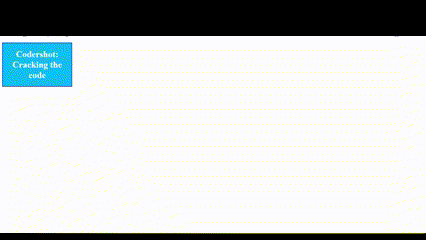
}Example:
<!DOCTYPE html>
<html>

<head>
    <style>
        h1 {
            color: white;
            text-align: center;
        }

        div {
            background: lightblue;
			border: 4px solid blue;
            position: relative;
            animation: cds 7s infinite;
        }

        @keyframes cds {
            0% {
                top: 0px;
                width: 0px;
            }

            25% {
                top: 50px !important;
				background: lightblue;
				border: 4px solid blue;
            }

            50% {
                top: 100px !important;
				background: skyblue;
				border: 4px solid blue;
            }

            100% {
                top: 200px !important;
                color: white;
                background: rgb(4, 178, 246);
                border: 2px solid blue;
                width: 250px;
            }
        }
    </style>
</head>

<body>
        <div>
            <h1>Codershot: Cracking the code</h1>
        </div>
</body>

</html>
Output:
Uses of CSS Conditional Rules
- Adaptive Web Design Using Media Queries.
- Finding Features with @supports.
- Personalize a webpage’s look for printing.
- For high-resolution (retina) displays, offer better-quality pictures and designs.
- Modify your style according to the orientation of the device (portrait or landscape).
Web designs that are extremely responsive, accessible, and flexible can be created with CSS conditional rules via media queries and featured queries. These guidelines allow developers to make assured that their websites work well for users across a variety of screens, devices, and user preferences.
READ ALSO: SOLUTION OF ‘WORKED IN PYTHON OR JAVA’