Table of Contents
ToggleCSS Media Queries
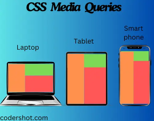
Cascading Style Sheets (CSS) media queries are a characteristic that allows you to apply various styles to different screen sizes and devices. They enable designers to make designs that are responsive to different screen sizes, orientations, and other aspects of the viewing surroundings.
CSS media queries: what are they?
A CSS trick called media query was first presented in CSS3. It contains a block of CSS attributes using the @media rule only when a specific condition is met.
You can check a lot of things with media queries, like:
- The viewport’s width and height.
- Viewport resolution orientation (landscape or portrait).
Syntax:
@media media-type and (media-feature){
                                         element{
                                                          /*CSS code */ ;
                                                            }
                                                                }

Breakpoints in Media Queries
The specific locations at which a webpage’s layout adjusts to meet different sizes of screens and orientations are known as breakpoints in media queries used by CSS. It is necessary to create responsive designs that offer the best possible viewing experience on a variety of devices.
CSS Media Types
The type of media or device that a document will appear on can be specified using CSS media types in media queries. They assist in applying particular styles according to the intended device. The major media types for CSS are as follows:
- all: applied to all media-type gadgets.
- print: utilized in the print preview mode.
- screen: used with tablets, smartphones, PC screens, and so forth.
Keywords:
- not: A media query’s full meaning is reversed by the “not” term.
- only: The styles are applied specifically for the designated media type using the “only” keyword. It stops the styles from being applied by earlier browsers that don’t support media queries.
- and: The “and” keyword combines one or more media attributes with a media type.
CSS Media Queries Features
The following are some often utilized media features:
| VALUE | DESCRIPTION |
| orientation | The viewport’s orientation. either in a portrait or landscape. |
| max-height | The viewport’s highest point. |
| min-height | The viewport’s minimum height. |
| height | The viewport’s height, including the scrollbar. |
| max-width | The viewport’s maximum width. |
| min-width | The viewport’s minimum width. |
| width | The viewport’s width, including the scrollbar. |
CSS Media Queries Example
Example: Responsive Navigation Menu Bar using media queries in css
<!DOCTYPE html>
<html lang="en">
<head>
<meta charset="utf-8">
<meta name="viewport" content="width=device-width, initial-scale=1">
<style>
* {
  box-sizing: border-box;
}
.nav {
  overflow: hidden;
  background-color: peru;
}
.nav a {
  float: left;
  display: block;
  color: #f2f2f2;
  text-align: center;
  padding: 14px 16px;
  text-decoration: none;
  font-size: 20px;
}
.nav a:hover {
  background-color: rgb(244, 179, 115);
  color: black ;
}
@media screen and (max-width: 700px) {
  .nav a {
    float: none;
    width: 100%;
  }
}
</style>
</head>
<body>
<h1>CSS Media Queries Example</h1>
<h2>Responsive Navigation Menu Bar</h2>
<div class="nav">
  <a href="#">Home</a>
  <a href="#">About us</a>
  <a href="#">Courses</a>
  <a href="#">Contact</a>
</div>
</body>
</html>
Output:

Essential Considerations for CSS Media Queries
- Take a Mobile-First Approach First: Prioritize designing for tiny screens before adding styles for larger ones.
- Utilize Logical Breakpoints: Don’t base breakpoints on device sizes; instead, base them on content requirements.
- Merge Media Features: Utilize and, not, and only to establish certain circumstances.
- Look at Various Devices: Make sure your design is compatible with a range of screen sizes and devices.
- Optimize Performance: For efficiency, reduce the quantity of media queries.
READ ALSO: CSS FLEXBOX


