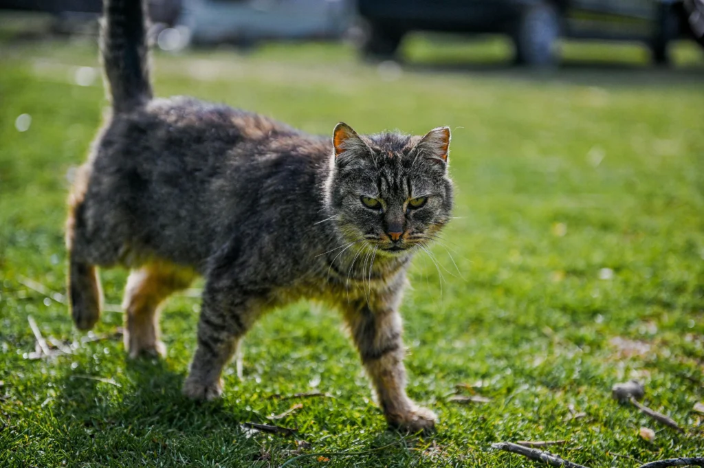
In the realm of web design, animations can transform a static page into an engaging visual experience. Today, we’re diving into a fun and illustrative example of this transformation: a whimsical cat’s walk across the screen with some cool CSS animations. Let’s break down the provided HTML and CSS code to understand how it achieves this effect.
Table of Contents
ToggleUnderstanding the HTML Structure for this fantastic cat’s walk animation
Here’s a concise overview of the HTML:
<!DOCTYPE html>
<html lang="en">
<head>
    <meta charset="UTF-8">
    <meta name="viewport" content="width=device-width, initial-scale=1.0">
    <title>cat walk</title>
</head>
<style>
    /* CSS code here */
</style>
<body>
    <div id="marco">
        <div id="cielo"></div>
        <div id="luna"></div>
        <div id="gato"></div>
        <div id="muro"></div>
        <div id="edificios"></div>
    </div>
</body>
</html>
The HTML structure consists of a main div container with the id marco, which houses five child div‘s: cielo, luna, gato, muro, and edificios. Each of these elements serves a specific purpose in creating the scene.
#marco: The overarching container for the scene.#cielo: Represents the sky with a gradient background.#luna: Displays the moon.#gato: The animated cat.#muro: Represents the ground or bottom part of the scene.#edificios: Shows the scrolling buildings.
Diving into the CSS
Let’s dissect the CSS styling and animations that bring the cat’s walk to real life:
GENERAL STYLING
html {
    font-size: 20px;
    margin: 0;
    background: #0c0207;
}
- Font Size and Margin: Sets a base font size for scaling and removes default margins.
- Background Color: Provides a dark, nighttime backdrop.
Container and Background Setup
#marco {
    width: 1325px;
    height: 500px;
    overflow: hidden;
    border-radius: 16px;
    margin-top: 2em;
}
- Dimensions and Overflow: Defines the container’s size and hides overflow, ensuring no content spills outside.
- Border Radius: Rounds the corners for a softer look.
#cielo {
    border-radius: 16px;
    width: 1325px;
    height: 500px;
    background: linear-gradient(to bottom, #0b4c5f 0% 52%, #0c0207 100%);
    position: absolute;
    z-index: -30;
    top: 0;
    margin-top: 2em;
}
- Gradient Background: Creates a gradient for the sky transitioning from a lighter blue to dark.
- Positioning and Z-Index: Ensures it stays in the background.
Animated Buildings
#edificios {
    background: url('https://res.cloudinary.com/pastelitos/image/upload/v1610526533/eva/edificiosOne_fsg7nx.svg');
    height: 500px;
    width: 1325px;
    z-index: -10;
    top: 6.5em;
    background-position: 0px 0px;
    animation: animar_edificios 120s linear infinite;
    position: absolute;
}

@keyframes animar_edificios {
    from { background-position: 0 0; }
    to { background-position: 100% 0; }
}
- Background Image: Utilizes a repeating SVG image to simulate buildings.
- Animation: Moves the background image horizontally to create the effect of buildings scrolling by.
Moon and Wall Design
#luna {
    width: 6em;
    height: 6em;
    border-radius: 50%;
    box-shadow: 30px 10px 0 #F7F8E0;
    margin-top: 1em;
    margin-left: 50%;
    position: absolute;
    z-index: -19;
}
- Circular Moon: Styled as a round element with a subtle shadow, positioned in the top-center of the screen.
#muro {
    height: 23em;
    width: 100%;
    background: linear-gradient(to bottom, #416663 0%, #0c0207 19%);
    bottom: 0px;
}
- Wall: A gradient that mimics the ground or bottom part of the scene, stretching across the width.
Animated Cat
#gato {
    background: url('https://res.cloudinary.com/pastelitos/image/upload/v1610526571/eva/gatito_pushui.svg');
    height: 297px;
    width: 507.5px;
    margin-top: 2em;
    margin-left: 2em;
    z-index: 10;
    animation: sprite-animation 1.2s steps(16, end) infinite;
}

@keyframes sprite-animation {
    from { background-position: 0 0; }
    to { background-position: -8120px 0; }
}
- Sprite Animation: Uses a sprite sheet to animate a cat walking. The
stepsfunction ensures the animation advances frame by frame, creating a smooth walking effect.

Putting It All Together
When you load this HTML and CSS, you’ll see a charming scene: a cat’s walk across a cityscape under a moonlit sky. The #marco container holds all elements in place, while CSS animations bring motion and life to the scene. The moving buildings create the illusion of movement, and the cat’s animation provides a playful focal point.
This example showcases how CSS animations can be leveraged to create engaging visual effects without relying on JavaScript. By combining gradients, background images, and keyframe animations, you can craft compelling web experiences that captivate your audience.
Also get updated and keep learning with us.


