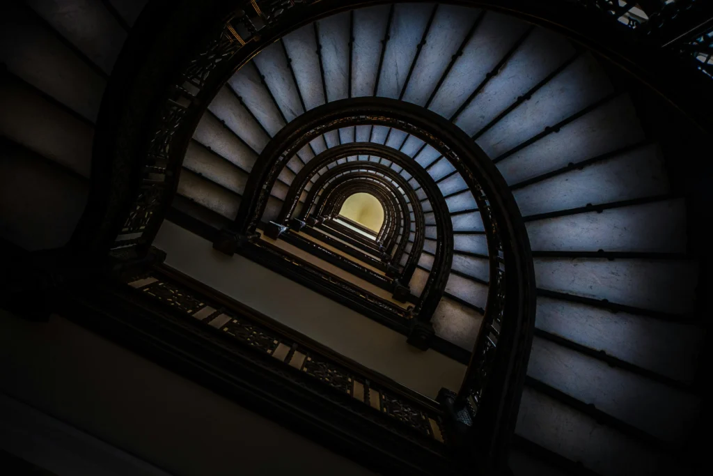
Welcome to another exciting exploration of web design! Today, we’re diving into a mesmerizing example of HTML and CSS animation. This particular code creates a “never-ending illusion” with rotating, fading images in a 3D space. Let’s break down how it works and understand the magic behind it.

Table of Contents
ToggleThe Structure For Never Ending Illusion
The HTML and CSS code provided creates a stunning visual effect through animation and 3D transformations. Here’s a high-level overview of the key components:
HTML Layout
<!DOCTYPE html>
<html lang="en">
<head>
    <meta charset="UTF-8">
    <meta name="viewport" content="width=device-width, initial-scale=1.0">
    <title>NEVER ENDING ILLUSION</title>
</head>
<body>
    <div class="g-container">
        <div class="g-group">
            <div class="item item-right"></div>
            <div class="item item-left"></div>
            <div class="item item-top"></div>
            <div class="item item-bottom"></div>
            <div class="item item-middle"></div>
        </div>
        <div class="g-group">
            <div class="item item-right"></div>
            <div class="item item-left"></div>
            <div class="item item-top"></div>
            <div class="item item-bottom"></div>
            <div class="item item-middle"></div>
        </div>
    </div>
</body>
</html>
This HTML creates two groups (g-group), each consisting of five item divs. Each item represents a face of a cube or a rectangular prism.
CSS Magic
The CSS code is where the real magic happens. Here’s a breakdown:
html, body {
  height: 100%;
  width: 100%;
  overflow: hidden;
  background: #000;
  display: flex;
}

.g-container {
  margin: auto;
  perspective: 4px;
  perspective-origin: 50% 50%;
  position: relative;
  animation: hueRotate 21s infinite linear;
}

.g-group {
  position: absolute;
  width: 1000px;
  height: 1000px;
  left: -500px;
  top: -500px;
  transform-style: preserve-3d;
  animation: move 12s infinite linear;
}

.item {
  position: absolute;
  width: 100%;
  height: 100%;
  background: url(https://z3.ax1x.com/2021/08/20/fLwuMd.jpg);
  background-size: cover;
  opacity: 1;
  animation: fade 12s infinite linear;
  animation-delay: 0;
}

.item-right { transform: rotateY(90deg) translateZ(500px); }
.item-left { transform: rotateY(-90deg) translateZ(500px); }
.item-top { transform: rotateX(90deg) translateZ(500px); }
.item-bottom { transform: rotateX(-90deg) translateZ(500px); }
.item-middle { transform: rotateX(180deg) translateZ(1000px); }

@keyframes move {
  0% { transform: translateZ(-500px) rotate(0deg); }
  100% { transform: translateZ(500px) rotate(0deg); }
}

@keyframes fade {
  0% { opacity: 0; }
  25%, 60% { opacity: 1; }
  100% { opacity: 0; }
}

@keyframes hueRotate {
  0% { filter: hue-rotate(0); }
  100% { filter: hue-rotate(360deg); }
}
Key Components Explained
Container and Perspective:
- The
.g-containerclass applies a perspective effect and animates a hue rotation filter to create a colorful visual effect over time. perspective: 4pxprovides a very close perspective depth, making the 3D effect subtle but noticeable.
Groups and Movement:
- The
.g-groupclass is animated with themovekeyframe animation. This animation moves the group in the Z-axis, creating a sense of depth and rotation. - The
animation-delayon the second.g-groupcreates a phase shift between the two groups, enhancing the illusion of endless motion.
Items and Transformations:
- Each
.itemdiv is styled to appear as a face of a 3D object. The use ofrotateY,rotateX, andtranslateZtransforms each face into its proper position. - The
.itemclass has a background image and afadeanimation that alternates its opacity to create a smooth fading effect.
Animations:
@keyframes moveanimates the.g-groupfrom one Z position to another, creating the illusion of a rotating 3D object.@keyframes fadecontrols the visibility of each item, fading them in and out in a cyclic manner.@keyframes hueRotateapplies a continuous color shift to the.g-container, giving a dynamic, shifting color effect.
Bringing It All Together
This code creates an impressive visual effect using only HTML and CSS. The combination of 3D transforms, keyframe animations, and CSS filters results in a captivating “never-ending illusion.” The rotating, fading faces and the shifting colors come together to create an engaging and interactive experience for the viewer.
Whether you’re a web designer looking to add a unique touch to your projects or just experimenting with CSS animations, this example is a fantastic demonstration of what’s possible with modern web technologies. By understanding and manipulating these techniques, you can create stunning visual effects that captivate and engage users in innovative ways.
Feel free to experiment with the code, adjust the animations, and see how you can enhance the illusion further. With a bit of creativity and exploration, the possibilities are endless. Happy coding, and may your designs continue to amaze and inspire!


