Table of Contents
ToggleCSS Animations
A useful technique in web design, CSS Animations provide dynamic and interesting user experiences. Without using JavaScript or Flash, they allow developers to animation changes in the style characteristics of HTML components, improving visual appeal.
An Understanding of CSS Animations
An element’s movement between several states can be animated using CSS animations. CSS animation is the process of gradually altering an element’s style. Transformations like moving, rotating, scaling, and color changes can fall under this category.
For Example: You could construct a basic animation that changes the color of a button as it is hovered over, or you could make more intricate animation like a logo that pops into view.

A variety of web page elements can have their appearance and behavior altered by CSS animations. They are defined with the help of the @keyframes rule, describing the element’s animation attributes as well as the precise times at which they should change.
Main Elements of CSS Animations
The following are the main elements of a CSS animation:
- Keyframes: At different stages of the animation, define the styles.
- Animation Properties: Indicate the animation’s duration, timing mechanism, and other details.
1. The @keyframes Rule:
In CSS, the @keyframes rule is used to specify how an animation will behave over time. You can designate the keyframes, or transitional points, that denote the style shifts that take place during the animation. The animation’s keyframes dictate the styles that should be used at particular points.
Syntax:
@keyframes animation-name{
                 from{
                             /* initial keyframes or styles*/
                                }
                  to{
                           /* final keyframes or styles*/
                              }
}
Keyframe’s stages:
You can use keywords like ‘from’ and ‘to’, or percentages, to specify the animation’s steps inside the @keyframes rule.
- percentages (0%, 50%, 100%, and so on): These show how the animation progresses from the beginning (0%) to the finish (100%).
- ‘from’ and ‘to’: 0% and 100%, respectively, are the equivalents of these keywords.
Creating CSS animations requires careful consideration of the @keyframes rule, which allows you to precisely control how items change states.
Example:
<!DOCTYPE html>
<html>
<head>
    <style>
        #main {
            animation-name: color;
            animation-duration: 5s;
            padding-top: 25px;
            padding-bottom: 25px;
            font-family: Cambria;
        }

        @keyframes color {
            0% {
                background-color: skyblue;
            }

            50% {
                background-color: lightblue;
            }

            100% {
                background-color: blue;
            }
        }
    </style>
</head>
<body>
    <div id="main">
        <h2>CSS Animations</h2>
        <h3>THE @keyframes RULE</h3>
    </div>
</body>

</html>
Explanation:
- The animation changes from sky blue to lightblue to blue over 5 seconds.
Output:


2. Animation Properties
| PROPERTY | DESCRIPTION | EXAMPLE | VALUES |
| animation-name | It is used to provide the @keyframes identifying the animation’s name. | animation-name: slide; | slide, fade-in, rotate, and so on. |
| animation-duration | It can be used to define the amount of time an animation takes to finish a cycle. | animation-duration: 2s; | Time units used milliseconds (ms) and seconds (s), for example, 500 ms and 2s. |
| animation-timing-function | It describes the keyframe transitions that animations use. The animation-timing-function can be adjusted to one of numerous presets in CSS, including linear, ease, ease-in, ease-out, and ease-in-out. | animation-timing-function: linear; | linear, ease, ease-in-out, ease-out, step-start, step-end, etc. |
| animation-delay | It shows how long an animation will take to begin. | animation-delay: 1s; | delay-time units used milliseconds (ms) and seconds (s), for example, 600 ms and 3s. |
| animation-iteration-count | The animation’s repetition count is indicated by this. | animation-iteration-count: infinite; | any positive integer like 1, 2, 3 and infinite |
| animation-direction | It indicates the animation’s direction. | animation-direction: alternate; | standard, reverse, alternative, and alternate-reverse. |
| animation-fill-mode | The way styles have been used before as well as after animation is defined by it. | animation-fill-mode: forwards; | none, forwards, backwards, or both. |
| animation-play-state | This property indicates if the animation is in progress or not. | animation-play-state: paused; | running, paused |
| animation | A shorthand property that allows you to set every animation property at once | animation: slide 3s ease-in-out 0.5s infinite alternate; | name, duration, timing-function, delay, iteration-count, direction, fill-mode, play-state |
Some Examples of Animation properties:
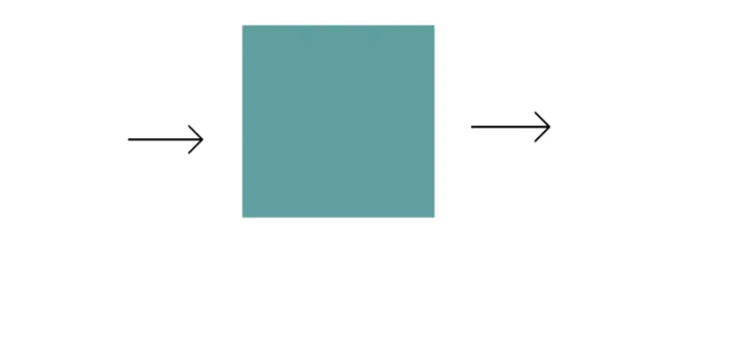
Example 1: We can horizontally animate a cadetblue box using CSS animation and the property slide.
<!DOCTYPE html>
<html>
<head>
<style>
.mybox {
  width: 90px;
  height: 90px;
  background-color: cadetblue;
  animation: slide 3s linear infinite;
}

@keyframes slide {
  0% { transform: translateX(0); }
  100% { transform: translateX(200px); }
}
</style>
</head>
<body>
<div class="mybox"></div>
</body>
</html>
Output:

Example 2: We use many timing functions to animate text elements, including ease, linear, ease-in, ease-out, and ease-in-out.
<!DOCTYPE html>
<html>
<head>
    <style>
        h2 {
            width: 300px;
            animation-name: text;
            animation-duration: 5s;
            animation-iteration-count: infinite;
            background-color: cadetblue;
        }

        #box1 {
            animation-timing-function: ease;
        }

        #box2 {
            animation-timing-function: linear;
        }

        #box3 {
            animation-timing-function: ease-in;
        }

        #box4 {
            animation-timing-function: ease-out;
        }

        #box5 {
            animation-timing-function: ease-in-out;
        }

        @keyframes text {
            from {
                margin-left: 60%;
            }

            to {
                margin-left: 0%;
            }
        }
    </style>
</head>

<body>
    <h2 id="box1">Ease: Slow at first, picks up speed, and then slows down.</h2>
    <h2 id="box2">Linear: The animation's speed remains constant.</h2>
    <h2 id="box3">Ease-in: Begins slowly and quickens as it goes on.</h2>
    <h2 id="box4">Ease-out: Quickly starts, then takes its time.</h2>
    <h2 id="box5">Ease-in-out: Slows down at first, then picks up speed.</h2>
</body>
</html>
Output:

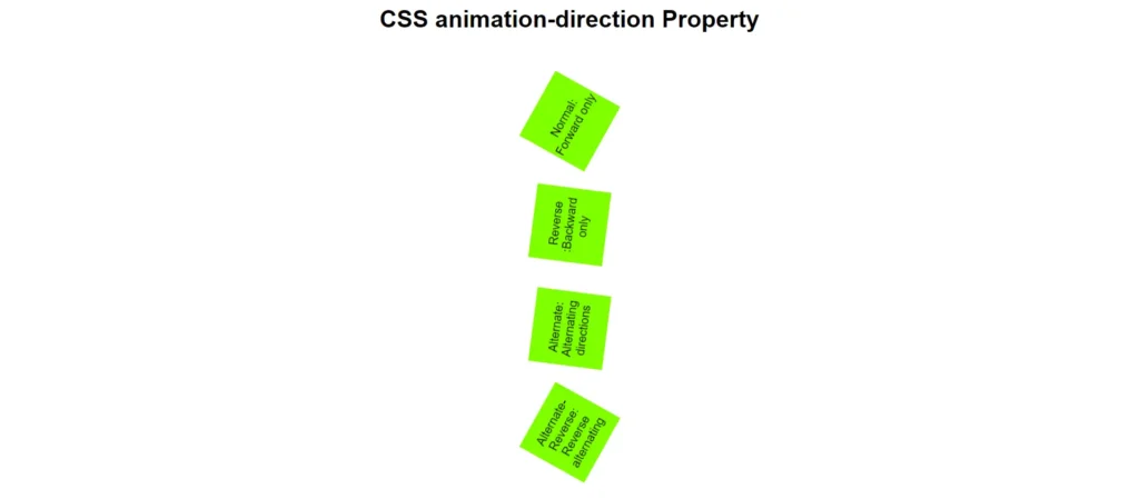
Example 3: Four of the boxes use CSS animations to rotate. The animation-direction value varies for each box.
<!DOCTYPE html>
<html>
<head>
  <title>CSS animation-direction Property</title>
  <style>
    body {
      font-family: Arial, sans-serif;
      text-align: center;
      margin: 0;
      padding: 0;
    }

    .main {
      display: flex;
      flex-direction: column;
      align-items: center;
      margin-top: 50px;
    }

    .mybox {
      width: 100px;
      height: 100px;
      background-color: chartreuse;
      margin: 20px;
      display: flex;
      justify-content: center;
      align-items: center;
      animation-name: rotate;
      animation-duration: 6s;
      animation-iteration-count: infinite;
    }

    .normal {
      animation-direction: normal;
    }

    .reverse {
      animation-direction: reverse;
    }

    .alternate {
      animation-direction: alternate;
    }

    .alternate-reverse {
      animation-direction: alternate-reverse;
    }

    @keyframes rotate {
      0% {
        transform: rotate(0deg);
      }
      100% {
        transform: rotate(360deg);
      }
    }
  </style>
</head>
<body>
  <h1>CSS animation-direction Property</h1>

  <div class="main">
    <div class="mybox normal">Normal: Forward only</div>
    <div class="mybox reverse">Reverse :Backward only</div>
    <div class="mybox alternate">Alternate: Alternating directions</div>
    <div class="mybox alternate-reverse">Alternate-Reverse: Reverse alternating</div>
  </div>
</body>
</html>
Output:

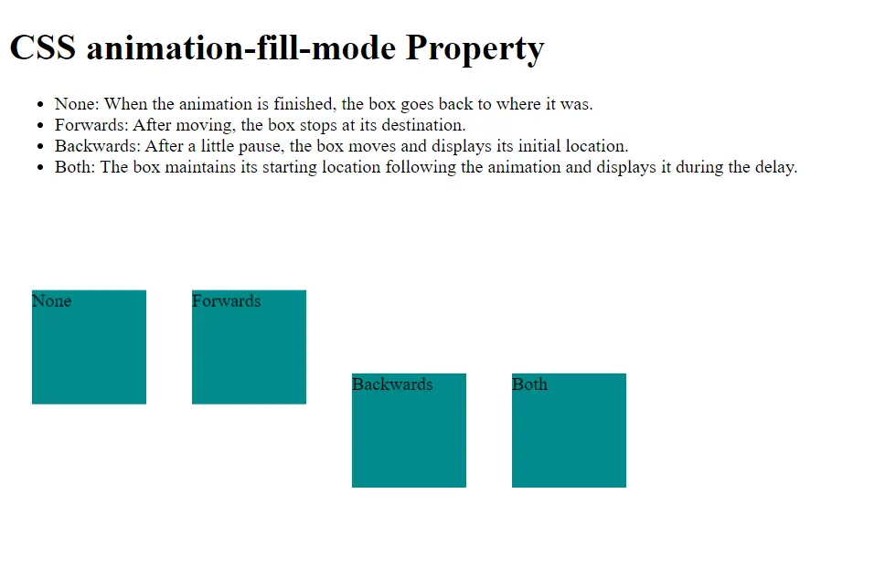
Example 4: The following example makes it clear how the CSS animation-fill-mode property affects how animated items behave.
<!DOCTYPE html>
<html lang="en">
<head>
    <style>

        .mybox {
            width: 100px;
            height: 100px;
            background-color: darkcyan;
            margin: 20px;
            animation-duration: 2s;
            animation-name: slide;
        }
        .main{
            display: flex;
            margin-top: 10%;
        }
        .none {
            animation-fill-mode: none;
        }

        .forwards {
            animation-fill-mode: forwards;
        }

        .backwards {
            animation-fill-mode: backwards;
            animation-delay: 2s;
        }

        .both {
            animation-fill-mode: both;
            animation-delay: 2s;
        }

        @keyframes slide {
            0% {
                transform: translateY(0);
            }
            50% {
                transform: translateY(-150px);
            }
            100% {
                transform: translateY(0);
            }
        }
    </style>
</head>
<body>
    <h1>CSS animation-fill-mode Property</h1>
    <ul>
        <li>None: When the animation is finished, the box goes back to where it was.</li>
        <li>Forwards: After moving, the box stops at its destination.</li>
        <li>Backwards: After a little pause, the box moves and displays its initial location.</li>
        <li>Both: The box maintains its starting location following the animation and displays it during the delay.</li>
    </ul>
    <div class="main">
    <div class="mybox none">None</div>
    <div class="mybox forwards">Forwards</div>
    <div class="mybox backwards">Backwards</div>
    <div class="mybox both">Both</div>
</div>
</body>
</html>
Output:

Applications of CSS Animations
- Menu Transitions: Effortlessly navigate by sliding in and out.
- Hover Effects: Add visual cues to buttons and pictures.
- Loading Indicators: Make progress bars or spinners.
- Visual Feedback: Verify user activities, such as filling out forms.
- Dynamic Content: Animate elements as they enter and exit the viewport.
- Aesthetic Enhancements: Give webpages more vibrancy and individuality.
CSS Animation Layout Impact
The layout of an element may be impacted by CSS animations if the animated attributes (such as width, height, and margin) affect the layout. Generally speaking, though, animating attributes like transform and opacity improves performance.
In summary, while CSS animations can enhance visual dynamics, they can also lead to layout changes if not carefully managed.
READ ALSO: GET MORE INFORMATION ABOUT CSS TRANSITIONS TO MAKE YOUR PAGE MORE ATTRACTIVE.


