
CSS Flexbox
Introduction to CSS Flexbox
The CSS Flexbox layouts, also known as the Flexible Box Layout, were created in CSS3 to facilitate the creation of adaptable and effective layout frameworks, even in situations where the item sizes are dynamic or unknown.
It makes it possible to distribute space while aligning components in a container both vertically and horizontally.
Features of CSS Flexbox:
CSS Flexbox is an effective tool for designing responsive and flexible layouts, because of its salient features:
- Enhanced adaptability
- Items’ positioning and alignment
- The arrangement and flow of the items
- Appropriate distance
- The flex layout serves as the foundation for Bootstrap 4.
The goal of Flexbox is to enhance the capacity to design complex layouts using a straightforward and consistent syntax.
CSS Flexbox Layouts Module
Before the CSS Flexbox Layout Module was released, it was more difficult and required a variety of methods to create complex and responsive layouts. The following are a few of the often employed techniques:
- Block: Web page sections
- Inline: Text (The Content)
- Table: Data from a two-dimensional table
- Positioned: A component’s precise location
Challenges with Pre-Flexbox Methods
- Block-Based Layouts: These frequently call for clear fix workarounds and may result in problems with container height and element alignment.
- Tables-Based Layouts: Inflexible in structure and semantically wrong for non-tabular data.
- Position-Based Layouts: These layouts offered exact control, but they were rigid and needed manual modifications for designs that were responsive.
- Inline-block layouts: These layouts have vertical alignment restrictions and necessitate managing white space between components.
To obtain desired layouts, these solutions frequently required additional HTML elements, complicated CSS, and hacks.
CSS Flexbox Axes
- Main Axis: runs by default from left to right.
- Cross Axis: Flows from top to bottom.
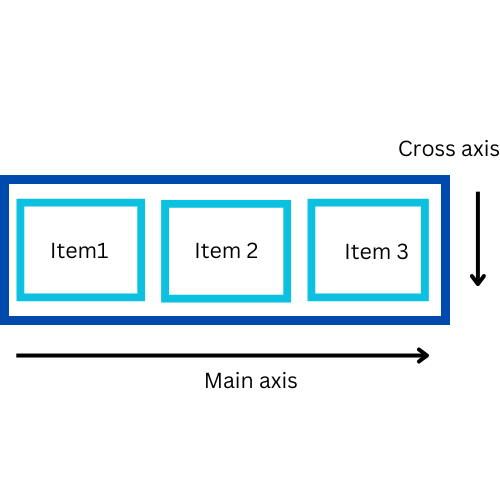
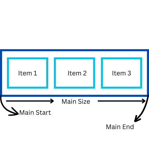
1.Main Axis: The principal axis that the flex elements are arranged along is the main axis. The primary axis is horizontal and aligned left to right by default.
Components of Main Axis:
- Main Start: The primary axis’s beginning.
- Main Size: The distance measured from Main Start to Main End.
- Main End: The primary axis’s endpoint.
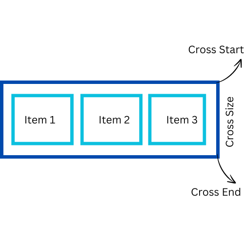
2. Cross Axis: The main axis and the cross axis are perpendicular to each other. It is the axis that the flex container’s elements are arranged along.
- The cross axis travels vertically if the main axis (row or row-reverse) is horizontal.
- Horizontally aligned is the cross axis when the primary axis(main axis) is vertical, such as a (column or column-reverse).
Components of Cross Axis:
- Cross Start: The cross-axis’s beginning.
- Cross Size: The distance from Cross Start to Cross End.
- Cross End: The cross-axis’s endpoint.
CSS Flexbox Components
- Flex Containers(Parent element): Flex items are held by the parent element called flex containers.
- Flex Items(Child elements): The offspring of a flex container are called flex items.
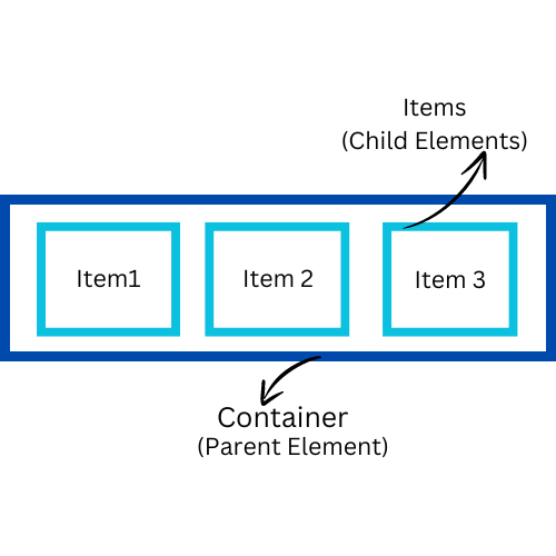
1.Flex Container:
- A flex container (parent element) uses flexbox to layout its flex items(child element).
- A display: flex; or display: inline-flex; attribute is applied to an element to create the flex container.
- All of an element’s direct children instantly become flex items once it is specified as a flex container.
Flex Containers Properties:
| PROPERTY | DESCRIPTION | VALUE | EXAMPLE |
| Display | describes the characteristics of a flexible box. | Flex and inline-flex | display: flex; |
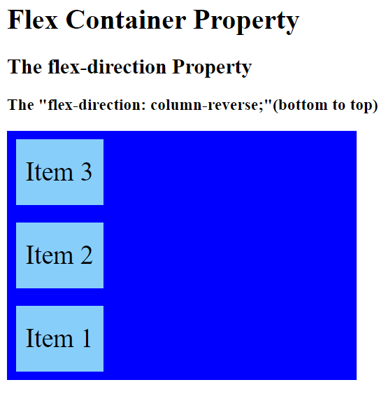
| Flex-direction | specifies the flex items’ direction. | column, column-reverse, row, row-reverse. | flex-direction: column-reverse; |
| Flex-wrap | determines whether flex objects need to be wrapped. | wrap, wrap-reverse, nowrap. | flex-wrap: nowrap; |
| Flex-flow | Encoded for both flex-wrap and flex-direction. | flex-direction and flex-wrap | flex-flow: column wrap; |
| Justify-content | The main axis is used to distribute space around and between content objects. | Space-between, Space-around, Space-evenly, Center, and Flex-start and Flex-end. | justify-content: space-between; |
| Align-items | Fits flex components in a cross-axis alignment. | stretch, baseline, center, flex-start, and flex-end. | align-items: center; |
| Align-content | lines inside of a flex container are aligned. | stretch, center, space-between, space-around, flex-start, and flex-end. | align-content: center; |
Example:
<!DOCTYPE html>
<html>
<head>

<title>CSS Flexbox Property</title>
<style>
.container {
  display: flex;
  flex-direction: column-reverse;
  background-color: Blue;
  width: 400px;
}

.container div {
  background-color: lightskyblue;
  width: 100px;
  margin: 10px;
  text-align: center;
  line-height: 75px;
  font-size: 30px;
}
</style>
</head>
<body>
<h1>Flex Container Property</h1>
<h2>The flex-direction Property</h2>
<h3>The "flex-direction: column-reverse;"(bottom to top)</h3>
<div class="container">
  <div>Item 1</div>
  <div>Item 2</div>
  <div>Item 3</div>
</div>
</body>
</html>
Output:
2. Flex Items:
- In a Flexbox arrangement, flex items are the offspring of a flex container.
- To adjust these elements’ size, arrangement, and alignment inside the container, you can work with their flex properties.
Flex Items Properties:
| PROPERTY | DESCRIPTION | VALUE | EXAMPLE |
| Order | maintains control over the flex elements’ arrangement inside the flex container. | Integer (0 by default). | order: 1; |
| Flex-grow | describes the capacity of a flexible item to expand as needed. | Number (0 by default). | flex-grow: 1; |
| Flex-shrink | specifies if a flex item can shrink if needed. | Number (by default 1). | flex-shrink: 1; |
| Flex-basis | establishes an element’s initial size before space distribution. | auto(by default), initial, inherit, number. | flex-basis: 40px; |
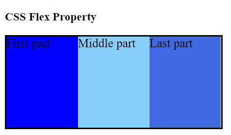
| Flex | shorthand for the terms “flex-basis,” “flex-grow,” and “flex-shrink.” | Flex-basis, flex-grow, and flex-shrink. | flex: 1 0 auto; |
| Align-self | In the case of individual flex items, overrides align-items. | stretch, auto, baseline, center, flex-start, and flex-end. | align-self: flex-end; |
Example: Flex Property with 3 value representation i.e. flex-shrink, flex-grow, and flex-basis.
<!DOCTYPE html>
<html>

<head>
	<title> CSS flex Property </title>
	<style>
		#coders {
			width: 350px;
			height: 150px;
			border: 3px solid black;
			display: flex;
            font-size: 20px;
		}

		#coders div {
			flex: 1 0 auto;
		}

		.cd1 {
			background-color: blue;
		}

		.cd2 {
			background-color: lightskyblue;
		}

		.cd3 {
			background-color: royalblue;
		}
	</style>
</head>

<body>
	<h3>CSS Flex Property</h3>
	<div id="coders">
		<div class="cd1"> First part </div>
		<div class="cd2"> Middle part </div>
		<div class="cd3"> Last part </div>
	</div>
</body>

</html>
Output:
READ ALSO: BASIC TO ADVANCE CSS LEARNING