
CSS Transitions
When items change states, web designers can create seamless animations by utilizing CSS transitions. Through visual feedback and more natural-feeling interactions, they improve the user experience. The principles, attributes, and optimal procedures of CSS transitions will all be covered in this tutorial.
CSS Transitions: What Are They?
CSS transitions allow CSS attributes to change gradually, enabling seamless animations, without requiring JavaScript.
Beyond only altering color, transitions can also animate other attributes, improving interactivity and user experience by making changes aesthetically pleasing. They may be used to provide a wide range of effects, including more intricate state changes, focus effects, and hover animations.
Simply, CSS transitions let you adjust property values gradually over a predetermined period. The most frequent way they are activated is by user interactions, like hovering over an element.
Key CSS Transition Properties
This illustrates how to use the four essential transition properties—transition-property, transition-duration, transition-timing-function, and transition-delay—to animate transitions between CSS attributes.
- transition-property
- transition-duration
- transition-timing-function
- transition-delay
- transition
1. transition-property:
The CSS transition property specifies which property or properties will experience a transition effect. You can use this property to choose the CSS properties you wish to animate when the transition (change) occurs.
Syntax:
element{
              transition-property: property name;
                         }
Values:
- none: This indicates that no property needs to be chosen.
- all: Even though not all properties can be animated, this specifies all the attributes that need to be chosen. Only the properties that can be animated will be affected.
- We can list one property at a time or several properties separated by commas. properties1, properties2,…, propertiesN.
2. transition-duration:
The duration of a transition animation can be specified in CSS using the transition-duration property. It establishes the duration of the changeover between states.
Syntax:
element{
             transition-duration: time;
                }
Values:
- time: The length of the transition, expressed in milliseconds (ms) or seconds (s).
- For instance, 400ms is 400 milliseconds, and 3s is 3 seconds.
3. transition-timing-function:
The CSS transition-timing-function property establishes the transition effect’s speed curve and controls how the animation properties’ intermediate values are computed over time. This feature makes the transition look more dynamic or smoother by controlling how quickly or slowly it accelerates or decelerates.
Syntax:
element{
              transition-timing-function: timing-function;
                     }
Values:
- ease: There’s a gradual start to the shift, a midpoint acceleration, and a final slowdown. This is the setting by default.
- linear: From beginning to end, the change moves forward at a steady pace.
- ease-in: The change begins softly and quickens as it gets closer to the finish.
- ease-out: The change begins swiftly and becomes more gradual as it goes on.
- ease-in-out: This transition begins slowly, picks up speed, and then picks back up speed as it nears completion.
- cubic-bezier(n,n,n,n): This function lets you use a cubic Bézier curve to construct a custom timing function. The curve’s shape is defined by the n values, which are control points with values ranging from 0 to 1.
- step-start and step-end: There is no gradual transition; instead, the change begins from the beginning and proceeds straight to the end state.
- steps(int, start/end): Specifies the number of steps in a stepping function. For instance, the transition would be divided into four steps beginning right away if we used steps(4, start).
4. transition-delay:
In CSS, the transition-delay property indicates how long to wait after a property change before initiating the transition effect. It causes a delay in the start of the changeover.
Syntax:
element{
           transition-delay: time;
               }
Values:
- time: The amount of time in milliseconds (ms) or seconds (s) that passes before the transition begins.
- For instance, 500ms denotes a 500-millisecond delay, and 2s denotes a 2-second delay.
- The default value, 0s or 0ms, indicates no delay, thus the change happens right away.
- Multiple delays: You can designate distinct delays for each property you’re transitioning by splitting them by a special character i.e. comma(,) (e.g., 0.5s, 1s).
5. transition:
One shorthand property in CSS that lets you provide transitional effects for one or multiple properties in one line of code is the transition property. It integrates all four of the transition properties—transition-duration, transition-timing-function, transition-property, and transition-delay—into one statement.
Syntax:
element{
               transition: property-name, duration, timing-function, delay; }
Default Values:
- transition-property: all
- transition-duration: 0s
- transition-timing-function: ease
- transition-delay: 0s
Examples of CSS Transitions properties
Example 1: Using ‘transition’ property only
<!DOCTYPE html>
<html>
<head>
<title> CSS Transitions</title>
<style>
.mybox {
width: 150px;
height: 100px;
background-color: chocolate;
transition: width 1.5s ease;
color: white;
font-family: monospace;
text-align: center;
font-size: 15px;
}
.mybox:hover {
width: 300px;
}
</style>
</head>
<body>
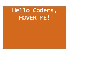
<div class="mybox">Hello Coders, <br>HOVER ME! </div>
</body>
</html>
Output:
BEFORE TRANSITION
AFTER HOVER TRANSITION EFFECT
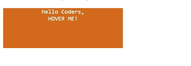
Explanation:
- Hover State: When the box is hovered over, its width increases to 300 pixels.
- Transition Effect: The width transition has a smooth linear growth (ease) over 1.5s (500 milliseconds).
Example 2: Using all four properties separately
<!DOCTYPE html>
<html>
<head>
    <title> CSS transition properties</title>
    <style>
.mybutton {
  background-color: lightgreen;
  color: white;
  padding: 20px 20px;
  border: 2px solid green;

  /* Applying transition and delay separately */
  transition-property: color;
  transition-duration: 1.5s;
  transition-timing-function: ease-in-out;
  transition-delay: 0.5s;
}

.mybutton:hover {
  color: green;
}
    </style>
</head>
<body>
    <button class="mybutton">Hello, Hover over me!</button>

</body>
</html>
Output:
BEFORE TRANSITIONS

AFTER USING ALL FOUR TRANSITION PROPERTIES

Explanation:
- Hover state: The button’s color of text turns green as you hover over it.
- Transition Delay: An ease-in-out time function will cause the color to shift gradually over a 1.5-second period, starting with a 0.5-second delay.
How To Use CSS Transitions?
To generate a transition effect, two specifications are needed:
- You wish to apply an effect to the CSS attribute.
- How long the effect lasts.
NOTE*: Since the default value for the duration component is 0, the transition will not occur if it is left out.
Realistic Use Cases
- Hover effects are among the most popular applications.
- Navigational menus can be made more user-friendly.
- For accordion panels, transitions in CSS can produce seamless opening and closing effects.
- Forms can feel more interactive by using transitions in CSS to enhance form fields.
CSS Transitional Properties
The majority of CSS attributes that contain colors or numbers can be transitioned.
Examples include:
- Margin
- Padding
- Opacity
- Width
- Height
- Color
- Font
- Border
- Background
- Box shadow
- Visibility
It’s crucial to remember that not every CSS property can move gracefully. Properties that cause non-continuous changes or necessitate recalculating the page’s geometry or layout are usually not transitional. Properties like display, for instance, cannot be changed.
Endless Transition Creation
CSS animations can be used in place of transitions to create a transition that runs forever. More control and versatility are available with CSS animations, which can also loop endlessly.
In Summary
CSS transitions are an effective way to improve your web pages’ aesthetic appeal. They work well, are simple to implement, and have a big potential to enhance user experience. You may develop captivating, interactive designs that set your website apart by being an expert with transitions in CSS. To find which method works most effectively for your projects, experiment with various characteristics and timing functions.
READ ALSO: CSS IMAGES