
CSS Website Layout
The CSS Website Layout is essential in determining its visual structure, organization, and responsiveness when developing a website. We’ll cover a variety of CSS strategies in this article to help you design efficient website layouts.
Developers can choose from a wide variety of layout styles for a website depending on its division into sections, which include the header, menus, content, and footer. A div tag can be styled with the CSS attribute to generate a variety of layouts.
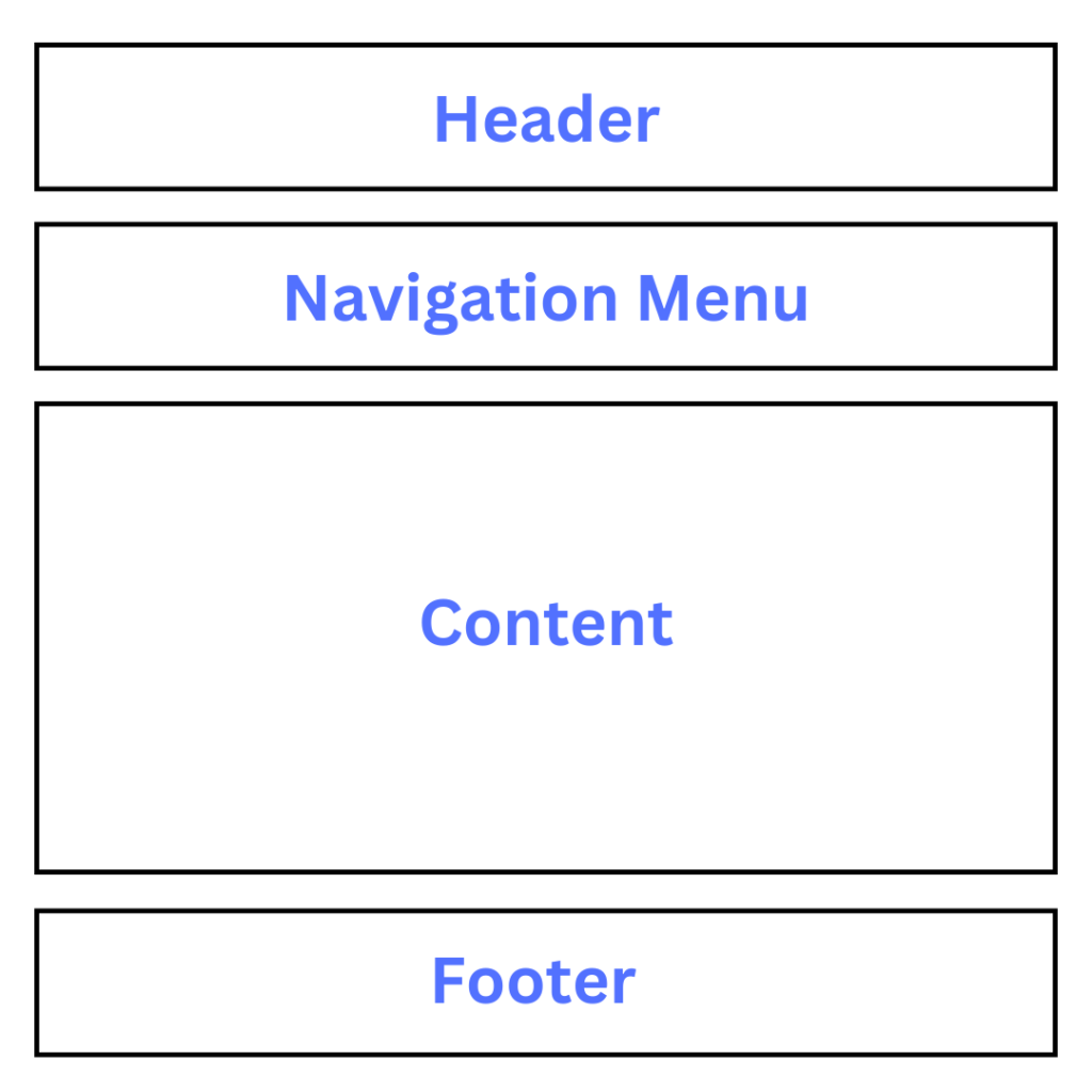
Structure of Website Layout
1. Header Section
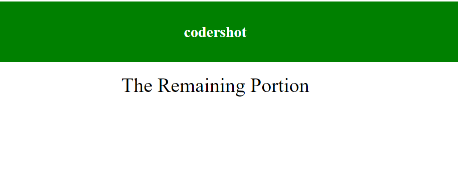
Usually, a website’s header section is located at the top or directly behind the top navigation menu. It frequently has the name or logo of the website. Here’s an illustration of how to use CSS to style the header:
Example:
<!-- This code describes the header section
of website layout -->
<!DOCTYPE html>
<html>

<head>
    <title>
        Website Layouts
    </title>

    <style>
        .header {
            background-color: green;
            padding: 15px;
            text-align: center;
        }
    </style>
</head>

<body>
    <div class="header">
        <h2 style="color:white;">
            codershot
        </h2>
    </div>
    <br>

    <center style="font-size:200%;">
        The Remaining Portion
    </center>
</body>

</html>
Output:
2. Navigation Menu
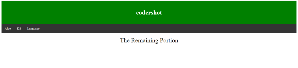
Links are provided via a navigation bar or menu for simple website navigation. This is an illustration of how to make a basic navigation menu:
Example:
<!DOCTYPE html>
<html>

<head>
    <title>
        Website Layout
    </title>

    <style>
        /* CSS property for header section */
        .header {
            background-color: green;
            padding: 15px;
            text-align: center;
        }

        /* CSS property for navigation menu */
        .nav_menu {
            overflow: hidden;
            background-color: #333;
        }

        .nav_menu a {
            float: left;
            display: block;
            color: white;
            text-align: center;
            padding: 14px 16px;
            text-decoration: none;
        }

        .nav_menu a:hover {
            background-color: white;
            color: green;
        }
    </style>
</head>

<body>

    <!-- header of website layout -->
    <div class="header">
        <h2 style="color:white;font-size:200%;">
            codershot
        </h2>
    </div>

    <!-- navigation menu for website layout -->
    <div class="nav_menu">
        <a href="#">Algo</a>
        <a href="#">DS</a>
        <a href="#">Language</a>
    </div><br>

    <center style="font-size:200%;">
        The Remaining Portion
    </center>
</body>

</html>
Output:
3. Content Section
The website’s content area serves as its major body. The content section can be divided into n columns by the user.
The most typical designs are:
- 1 Column Layout: Mobile layouts make the most use of it.
- 2 Column Layout: Tablets and laptops are the main devices that use this website layout.
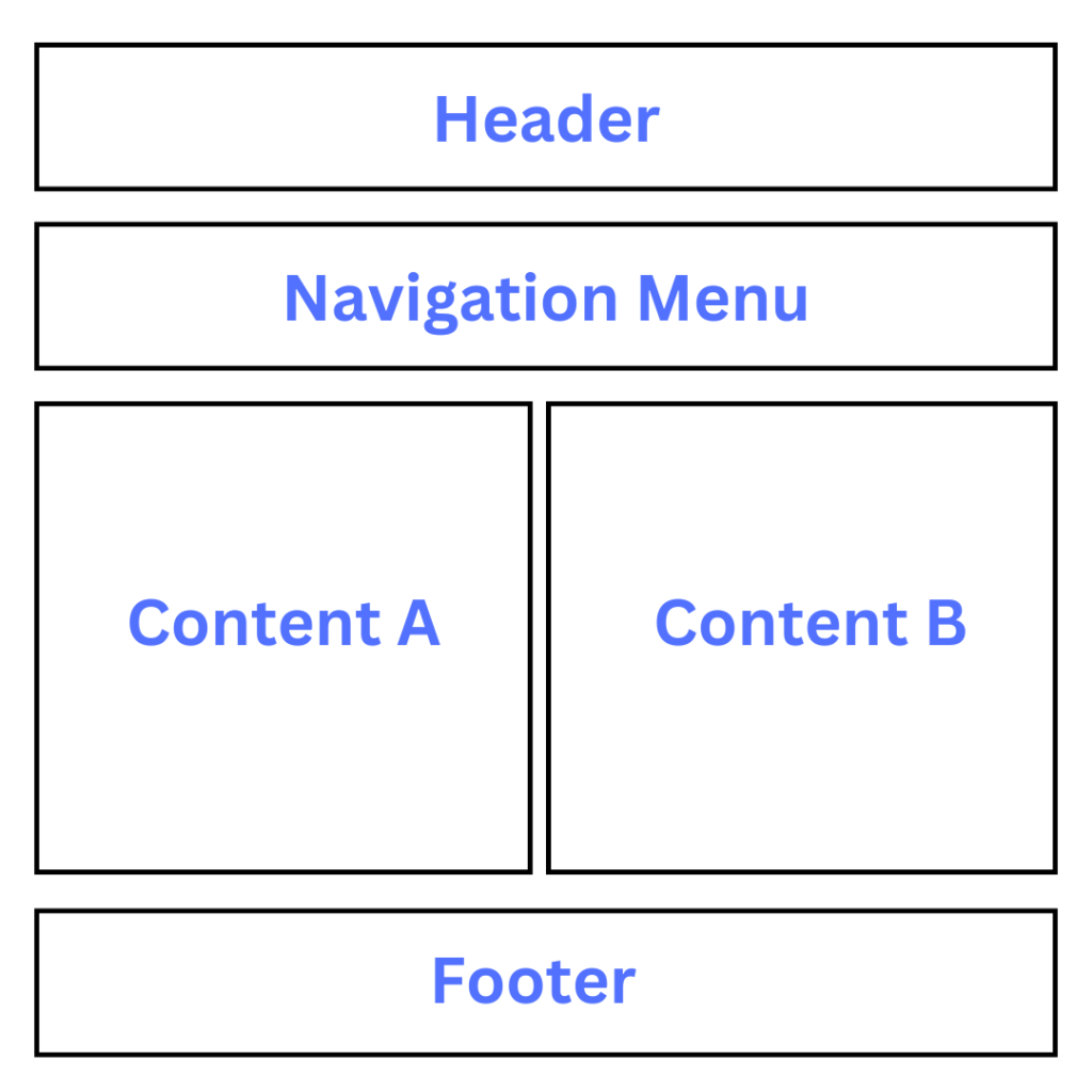
- 3 Column Layout: PCs are the primary platform for using this website style.
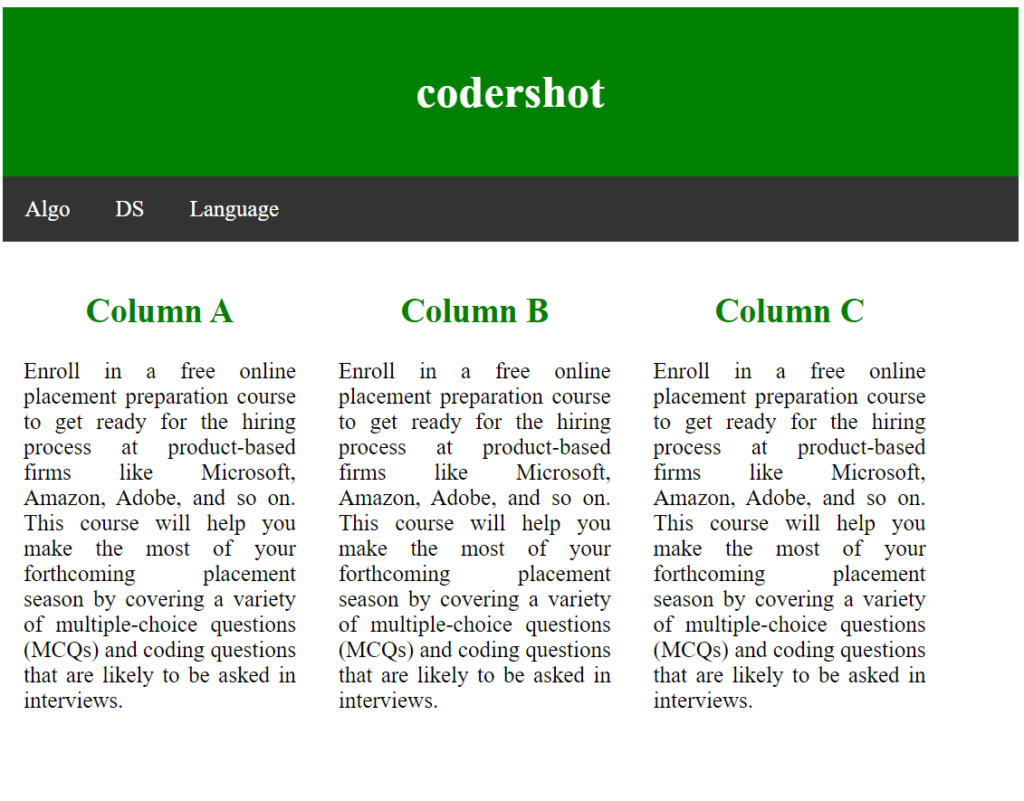
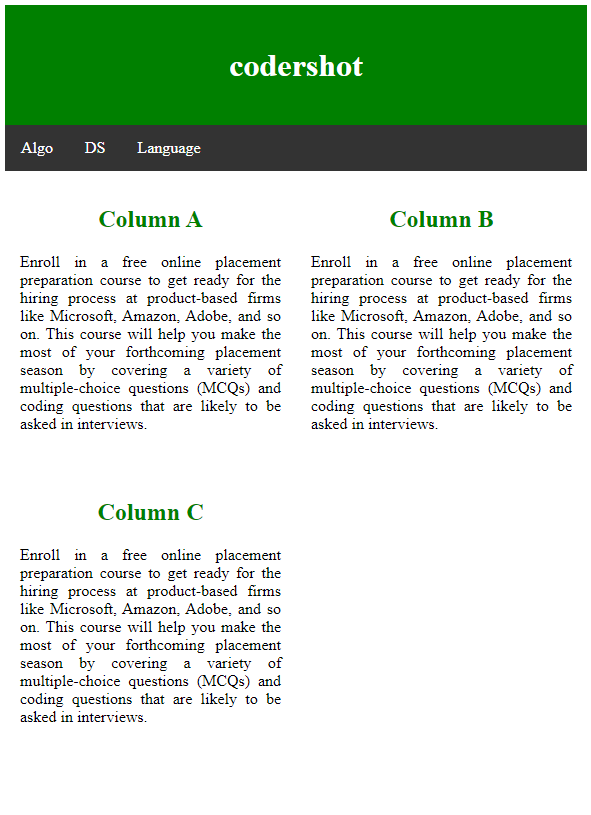
Additionally, a responsive layout that adapts to screen sizes can be created by the user. Take a look at the sample below. If the screen width is greater than 600 pixels, a 3-column layout will appear; if it is between 400 and 600 pixels, a 2-column layout will appear; and if the screen size is less than 400 pixels, a 1-column layout will appear.
Example:
<!DOCTYPE html>
<html>
<head>
<title>
Website Layout
</title>
<style>
* {
box-sizing: border-box;
}
/* CSS property for header section */
.header {
background-color: green;
padding: 15px;
text-align: center;
}
/* CSS property for navigation menu */
.nav_menu {
overflow: hidden;
background-color: #333;
}
.nav_menu a {
float: left;
display: block;
color: white;
text-align: center;
padding: 14px 16px;
text-decoration: none;
}
.nav_menu a:hover {
background-color: white;
color: green;
}
/* CSS property for content section */
.columnA,
.columnB,
.columnC {
float: left;
width: 31%;
padding: 15px;
text-align: justify;
}
h2 {
color: green;
text-align: center;
}
/* Media query to set website layout
according to screen size */
@media screen and (max-width:600px) {
.columnA,
.columnB,
.columnC {
width: 50%;
}
}
@media screen and (max-width:400px) {
.columnA,
.columnB,
.columnC {
width: 100%;
}
}
</style>
</head>
<body>
<!-- header of website layout -->
<div class="header">
<h2 style="color:white;font-size:200%">
codershot
</h2>
</div>
<!-- navigation menu of website layout -->
<div class="nav_menu">
<a href="#">Algo</a>
<a href="#">DS</a>
<a href="#">Language</a>
</div>
<!-- Content section of website layout -->
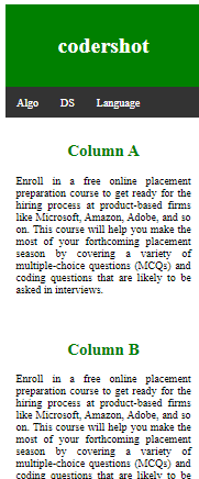
<div class="row">
<div class="columnA">
<h2>Column A</h2>
<p>
Enroll in a free online placement preparation course
to get ready for the hiring process at product-based
firms like Microsoft, Amazon, Adobe, and so on. This
course will help you make the most of your forthcoming
placement season by covering a variety of multiple-choice
questions (MCQs) and coding questions that are likely to
be asked in interviews.
</p>
</div>
<div class="columnB">
<h2>Column B</h2>
<p>
Enroll in a free online placement preparation course
to get ready for the hiring process at product-based
firms like Microsoft, Amazon, Adobe, and so on. This
course will help you make the most of your forthcoming
placement season by covering a variety of multiple-choice
questions (MCQs) and coding questions that are likely to
be asked in interviews.
</p>
</div>
<div class="columnC">
<h2>Column C</h2>
<p>
Enroll in a free online placement preparation course
to get ready for the hiring process at product-based
firms like Microsoft, Amazon, Adobe, and so on. This
course will help you make the most of your forthcoming
placement season by covering a variety of multiple-choice
questions (MCQs) and coding questions that are likely to
be asked in interviews.
</p>
</div>
</div>
</body>
</html>
Output: The screen’s width, which is more than 700 pixels:
The screen width, measured in pixels, between 400 and 600:
The screen width, which is fewer than 400 pixels:
4. Footer Section
At the bottom of the page is a part called the footer, which usually contains information about the website, copyrights, contact details, and so on.
Example:
<!DOCTYPE html>
<html>

<head>
    <title>
        CSS Website Layout
    </title>

    <style>
        /* Style for footer section */
        .footer {
            background-color: green;
            padding: 15px;
            text-align: center;
        }
    </style>
</head>

<body>
    <center style="font-size:200%;">
        Upper section
    </center>

    <!-- footer Section -->
    <div class="footer">
        <a href="#">About</a><br>
        <a href="#">Career</a><br>
        <a href="#">Contact Us</a>
    </div>
</body>

</html>
Output:

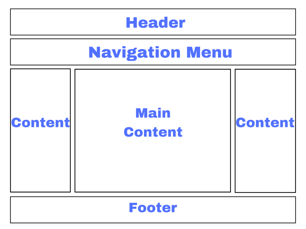
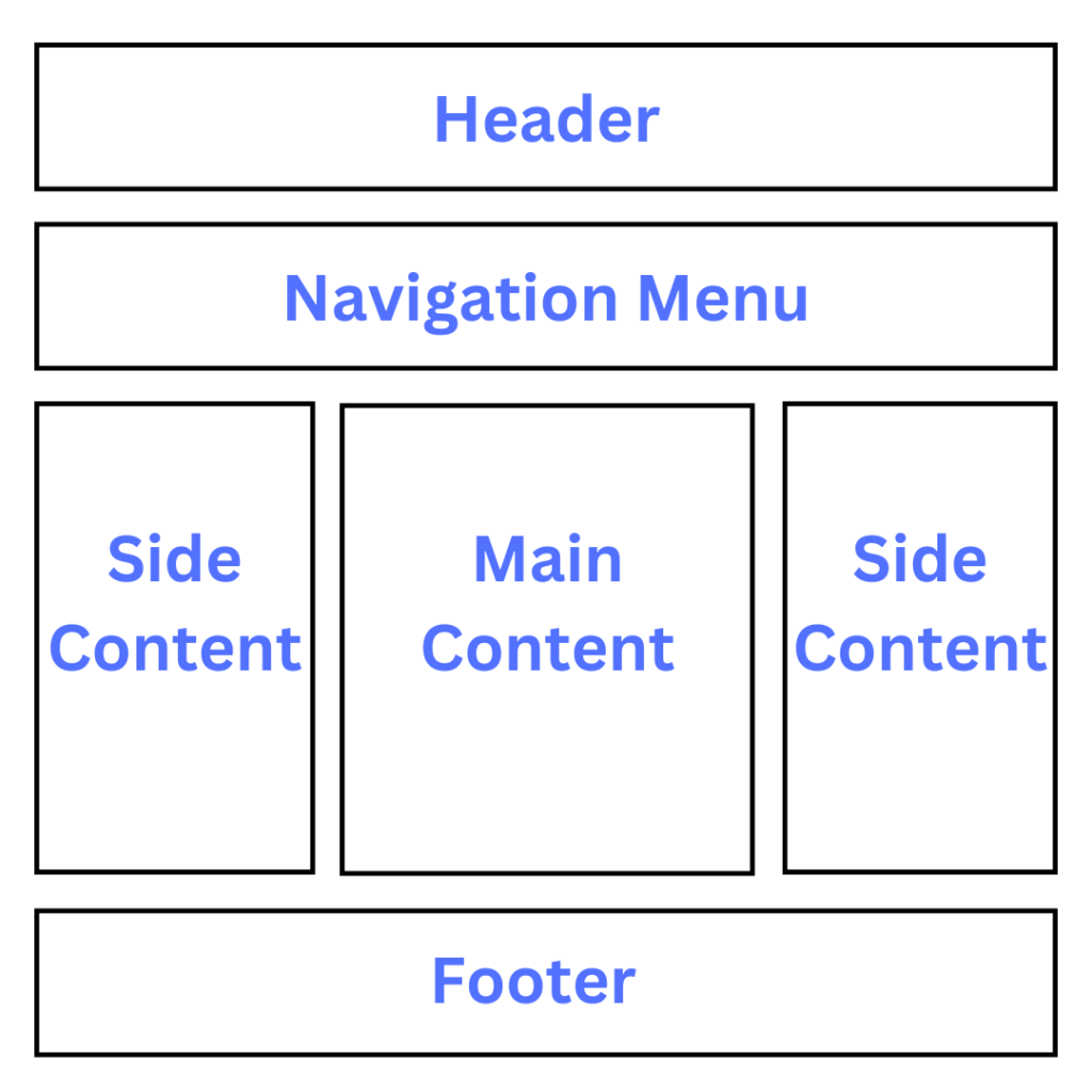
Essential Things to Keep in Mind
- The search bar, user profile, and website logo are in the header section.
- Links to the different article categories are provided in the navigation menu.
- The content portion is broken up into three sections, or columns, and has sidebars on the left and right that lead to further articles and adverts.
- This article is located in the main content section.
- Footer: The footer part, located at the bottom, has contacts, links, and an address.
In conclusion, Cascading Style Sheets, or CSS, is a strong tool that gives our web pages life. The division of formatting (CSS) and layout (HTML) improves the extendibility, adaptability, and sustainability of online implementations. Knowing CSS is essential for developing visually appealing and user-friendly websites, regardless of expertise level.