Table of Contents
ToggleCSS Logical Properties
A collection of features in CSS called CSS Logical Properties and Values gives programmers writing mode and direction-neutral control over the layout. This implies that you can design styles that, without requiring you to change the CSS, automatically adjust to various writing modes (horizontal, vertical), as well as directions (left-to-right, right-to-left).
What are CSS Logical properties?
In simple words, With the help of CSS Logical Properties, layout control is no longer dependent on text direction, allowing styles to easily adjust to various writing modes.
When working with logical attributes rather than directional ones, typing modes and the path(direction) of the text flow affect both spacing and layout. By allowing the webpage’s format and spacing to change based on the user’s writing style, it improves and becomes more responsive.
The directional qualities are considered in terms of:
- Top
- Right
- Bottom
- Left
The physical configuration of the user’s device is referred to by these names in the physical properties.
Logical properties are considered in terms of:
- block-start
- block-end
- inline-start
- inline-end
When opposed to directional qualities, logical attributes offer more flexibility. The spacing and arrangement of the material will adjust to reflect the user’s changing writing mode (language style).
CSS Logical Properties
CSS logical attributes Use the terms “block” and “inline” to clarify the writing’s direction.
- Block properties: In CSS, “block properties” refer to logical attributes that manage the size and spacing of layout elements around the block axis, effortlessly adjusting to various writing styles and text orientations.
It usually matches the horizontal writing mode’s vertical dimension.
- block-size: Indicates an element’s height.
- margin-block-start: Determines the upper margin.
- margin-block-end: Establishes the margin at the bottom.
- padding-block-start: Defines the padding at the top.
- padding-block-end: Affects the padding at the bottom.
- border-block start: Establishes the upper boundary.
- border-block-end: Indicates the border at the bottom.
Syntax:
element{
         block-property-name: value;
              }
Example:
<html lang="en">
<head>
    <meta charset="UTF-8">
    <meta name="viewport" content="width=device-width, initial-scale=1.0">
    <title>Logical Block Properties</title>
    <style>
        body{
            background-color: wheat;
        }
        .main {
            background-color: skyblue;
            width: 350px;
            height: 150px;
            margin-block-start: 40px;
            margin-block-end: 30px;
            padding-block-start: 20px;
            padding-block-end: 20px;
            border: 6px solid blue;
        }
    </style>
</head>
<body>
    <div class="main">
        <h1>Logical Block Properties</h1>
         <h2>Block properties example</h2>
    </div>
</body>
</html>
Output:
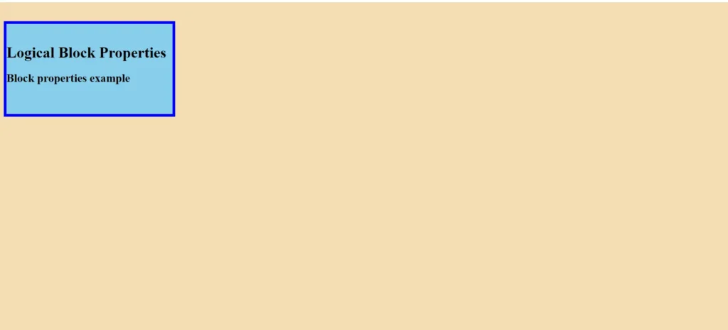
2. Inline properties: In CSS, “inline properties” are logical attributes that manage an element’s width and spacing around the inline axis so that it can easily adjust to various text orientations and writing styles.
This in horizontal writing forms usually corresponds to the horizontal dimension.
- inline-size: Indicates an element’s width.
- margin-inline-start: In left-to-right writing modes, this property sets the left margin.
- margin-inline-end: In left-to-right writing modes, margin-inline-end sets the right margin.
- padding-inline-start: In left-to-right writing modes, this sets the left padding.
- padding-inline-end: In left-to-right writing modes, this setting sets the proper padding.
- border-inline-start: In left-to-right writing modes, this defines the left border.
- border-inline-end: Specifies the right boundary for writing modes that move from left to right.
Syntax:
Element{
         inline-property-name: value;
}- Example:
<!DOCTYPE html>
<html lang="en">
<head>
    <meta charset="UTF-8">
    <meta name="viewport" content="width=device-width, initial-scale=1.0">
    <title>Logical Inline Properties</title>
    <style>
        body{
            background-color: rgb(198, 237, 250);
        }
        .main {
            background-color: skyblue;
            width: 350px;
            height: 150px;
            margin-inline-start: 25px;
            margin-inline-end: 40px;
            padding-inline-start: 15px;
            padding-inline-end: 20px;
            border: 6px solid blue;
        }
    </style>
</head>
<body>
    <div class="main">
        <h1>Logical Inline Properties</h1>
        <h2>Inline Properties Example</h2>
    </div>
</body>
</html>
Output:
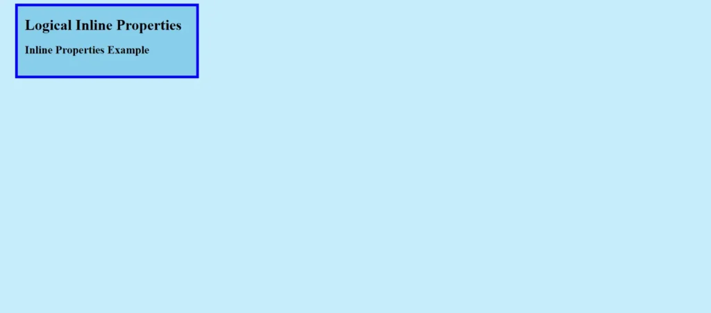
| PROPERTY | DESCRIPTION |
| inline-size | comparable to the property of breadth. |
| max-inline-size | The property’s equivalent to max-width. |
| min-inline-size | The property’s equivalent to min-width. |
| block-size | The attribute that corresponds to height. |
| max-block-size | max-height is equal to max-block-size. |
| min-block-size | min-height is equal to min-block-size. |
| margin-block-start | The top margin is the same as margin-block-start. |
| margin-block-end | The bottom margin is equivalent to margin-block-end. |
| margin-inline-start | The left margin’s equivalent. |
| margin-inline-end | The appropriate margin. |
| border-block-start | border-top is the same as border-block-start. |
| border-block-end | border-bottom is equal to border-block-end. |
| border-inline-start | The border-left equivalent. |
| border-inline-end | The border-right equivalent. |
| inset-block-start | The same as top. |
| inset-block-end | The opposite of bottom. |
| inset-inline-start | left is equivalent to inset-inline-start. |
| inset-inline-end | The right equivalent |
Examples: (1) A syntactical guide to using CSS’s logical features.
<html>
<head>
    <meta charset="UTF-8" />
    <meta http-equiv="X-UA-Compatible"
          content="IE=edge" />
    <meta name="viewport"
          content="width=device-width, initial-scale=1.0" />
    <title>Example</title>
    <style>
        html
        {
            background: lightpink;
        }
        .adding-border
        {
            font-size: 1.5rem;
            font-weight: 800;
            line-height: 1.5;
            color: #2f4f4f;
            padding: 2rem;
            border-inline-start: 1rem purple solid;
            border-block-start: 1rem blue solid;
            border-inline-end: 1rem green solid;
            border-block-end: 1rem red solid;
        }

        .inline-start
        {
            color: green;
        }
        .block-start
        {
            color: blue;
        }
        .inline-end
        {
            color: purple;
        }
        .block-end
        {
            color: red;
        }

        h2 {
            margin: 0.20rem;
        }
        .container{
            background-color: aquamarine;
        }
    </style>
</head>
<body>
    <div style="text-align: center">
       <h1 style="color: blue">Codershot</h1>
    </div>
    <div class="container">
        <div class="adding-border">
            <h2 class="block-start">block-start</h2>
            <h2 class="block-end">block-end</h2>
            <h2 class="inline-start">inline-start</h2>
            <h2 class="inline-end">inline-end</h2>
        </div>
    </div>
</body>
</html>
Output:
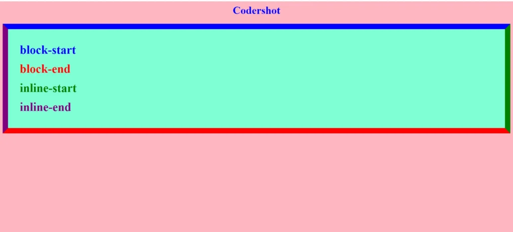
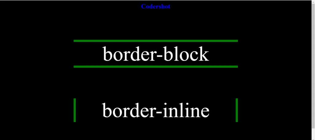
Example: (2) Demonstrate the distinction and application of inline and block logical features.
<!DOCTYPE html>
<html lang="en">
<head>
    <meta charset="UTF-8" />
    <meta http-equiv="X-UA-Compatible"
          content="IE=edge" />
    <meta name="viewport"
          content="width=device-width, initial-scale=1.0" />
    <title>Example</title>
    <style>
        *
        {
            margin: 0;
            box-sizing: border-box;
        }
        body
        {
            background-color: black;
            padding: 10px;
            text-align: center;
        }
        main
        {
            display: flex;
            flex-direction: column;
            justify-content: center;
            align-items: center;
            height: 100vh;
        }
        #border-block
        {
            border-block: 11px solid green;
            font-size: 101px;
            width: 801px;
            margin-block-end: 151px;
        }
        #border-inline
        {
            border-inline: 11px solid green;
            font-size: 101px;
            width: 801px;
        }

    </style>
</head>
<body>
    <header>
        <h1 style="color: blue">Codershot</h1>
    </header>
    <main>
        <p id="border-block" style="color: white">border-block</p>
        <p id="border-inline" style="color: white">border-inline</p>
    </main>
</body>
</html>
Output:
Important Considerations of CSS Logical properties
When utilizing the logical characteristics of CSS, keep in mind:
- Adaptability: They can write in both vertical and horizontal orientations, as well as in LTR and RTL text directions.
- Consistency: Maintain a consistent look across all locations.
- Fallbacks: To support older browsers, provide physical property fallbacks.
- Shorthand: For efficiency, use shorthand logical properties (padding-block, margin-inline, etc.).
- Layouts: Use Flexbox and CSS Grid with ease.
- Testing: Check designs over a range of text directions and writing styles.
- Accessibility: Make text easier to read and navigate across various writing systems and languages.
READ ALSO: CSS WEBSITE LAYOUT
